
Create Your Portfolio Using Next.js, Tailwind CSS, Stripe, and PayPal
Create a portfolio website using Next.js and Tailwind CSS with dark mode support, a donation page that integrates PayPal and Stripe
Introduction
In this tutorial, I show how to create a portfolio website. I will use Next.js and Tailwind CSS with Dark mode support. Also, I add a simple "Sponsor"/"Support Me" page which will enable anyone to donate something to the website author using Stripe or PayPal.
Good Reasons for having a Portfolio:
- Show your code off: You can show some awesome projects you create here that should impress everyone visiting your portfolio
- Express yourself: Normally, your personality does not shine through your resume, but you can use your portfolio website to do this.
- Improve your online footprint: Your online footprint is important if you want to apply for a job because new companies will always google your name.
tl;dr: Go to GitHub, clone this repository, and switch to folder v0. Add a .env.local with the missing environment variables and deploy the content on Vercel.
Setting Up Next.js And Tailwind Configuration
Next.js can be installed with preconfigured Tailwind CSS with this single command:
npx create-next-app -e with-tailwindcss your-portfolioAfterward, switch to your favorite IDE and open the project your-portfolio. In the project's root directory, you should create a components folder that will be used for every component within your Next.js app.
Additionally, you should add this folder as path to the tsconfig.json to better import the different components later. Then, add baseUrl if it is not already present.
The following snippet shows how the tsconfig.json should look like after adding both properties:
{
  "compilerOptions": {
    ...
    "baseUrl": ".",
    "paths": {
      "@components/*": [
        "components/*"
      ]
    }
  },
}
Now, you can activate Dark Mode Support in the app by editing the tailwind.config.js. You have to add darkMode: 'class' to the tailwind config so that it looks like this:
module.exports = {
  content: [
    './pages/**/*.{js,ts,jsx,tsx}',
    './components/**/*.{js,ts,jsx,tsx}',
  ],
  darkMode: 'class',
  theme: {
    extend: {},
  },
  plugins: [],
}
This is important because otherwise, the webpage could use the wrong styles from my examples.
Before continuing, you should install all dependencies by running npm install in your project folder.
To watch every change, you will implement while developing, you can start the project in development mode with npm run dev which starts an instance of your webpage on http://localhost:3000.
Create the Navigation Component
Create a new file called Navigation.tsx within the components folder of your project. It contains just your name as a link to /.
import Link from "next/link"
import React from "react"

const Navigation = () => {
    return (
        <div className="sticky top-0 z-20 py-2 md:py-6 md:mb-6 dark:bg-black bg-white">
            <div className="container px-4 mx-auto lg:max-w-4xl flex items-center justify-between">
                <div className="items-start flex">
                    <Link href="/">
                        <a className={"font-medium tracking-wider transition-colors text-gray-900 dark:hover:text-sky-500 hover:text-sky-500 uppercase dark:text-white"}>
                            Paul Knulst
                        </a>
                    </Link>
                </div>
            </div>
        </div>
    )
}

export default Navigation;
This file is used for the header section of your portfolio that will be shown at the top of the website. Later it will be filled with links to your subpages, and as you want to add support for Dark Mode, there are already some dark mode-specific CSS properties using dark:.
To see your navigation header, you should insert the Navigation component into your application. This is done by editing the _app.tsx as follows:
import '../styles/globals.css'
import type {AppProps} from 'next/app'
import Navigation from "@components/Navigation";

function MyApp({Component, pageProps}: AppProps) {
  return (
          <>
            <Navigation/>
            <Component {...pageProps} />
          </>
        )
}

export default MyApp
Creating a Footer Section
Next, you will create a footer containing some links to your Social Media accounts. Create a new file called Footer.tsx within the components folder and add the following code to it:
import React from "react";

const Footer = () => {
    return (
        <div className="mt-12 lg:mt-18 sm:pb-36 sm:py-12 py-6">
            <div className="max-w-4xl px-4 mx-auto text-gray-800 dark:text-white">
                <div className="pb-8 mb-2 border-t-2 border-gray-300 dark:border-white-300"/>
                <div className="flex flex-col justify-between lg:flex-row items-center">
                    <p>Built with Next.js, Tailwind</p>
                    <div className="flex flex-wrap pt-2 sm:space-x-4 space-x-2 font-medium lg:pt-0">
                        <a
                            href="https://twitter.com/paulknulst"
                            className={"transition-colors hover:text-yellow-500"}
                            target="_blank"
                            rel="noreferrer"
                        >
                            Twitter
                        </a>
                        <a
                            href="https://www.linkedin.com/in/paulknulst/"
                            className={"transition-colors hover:text-yellow-500"}
                            target="_blank"
                            rel="noreferrer"
                        >
                            LinkedIn
                        </a>
                        <a
                            href="https://github.com/paulknulst"
                            className={"transition-colors hover:text-yellow-500"}
                            target="_blank"
                            rel="noreferrer"
                        >
                            GitHub
                        </a>
                        <a
                            href="https://blog.paulknulst.de"
                            className={"transition-colors hover:text-yellow-500"}
                            target="_blank"
                            rel="noreferrer"
                        >
                            Medium
                        </a>
                    </div>
                </div>
            </div>
        </div>
    )
}

export default Footer;
As you can see here, I added Twitter, LinkedIn, GitHub, and Medium as links which you should edit to have your own social media links.
Afterward, you have to add the Footer component to the _app.tsx file to have it enabled on your portfolio page:
import '../styles/globals.css'
import type {AppProps} from 'next/app'
import Navigation from "@components/Navigation";
import Footer from "@components/Footer";

function MyApp({Component, pageProps}) {
    return <>
            <Navigation/>
            <Component {...pageProps} />
            <Footer/>
    </>
}

export default MyApp
Creating The Main Component
The main component will be the component that is displayed on the home page and will contain some text about you.
import React from "react"
import Image from "next/image"

const Main = () => {
    return (
        <div className="container px-4 mx-auto">
            <div
                className="lg:space-x-5 lg:flex lg:flex-row item-center lg:-mx-4 flex flex-col-reverse text-center lg:text-left">
                <div className="lg:px-4 lg:mt-12 ">
                    <h1 className="text-2xl font-bold text-gray-900 lg:text-5xl dark:text-white">
                        Hi there,
                    </h1>
                    <div className="mt-6 text-gray-800 dark:text-white">
                        <p className="mb-4">I work as a Full Stack Dev at <a
                            href="https://www.paulknulst.de"
                            className="font-bold transition-colors hover:text-sky-500" target="_blank"
                            rel="noopener">Link To Company</a>.
                        </p>
                        <p className="mb-4">Lorem Ipsum is simply dummy text of the printing and typesetting industry.
                            Lorem Ipsum has been the industry's standard dummy text ever since the 1500s, when an
                            unknown printer took a galley of type and scrambled it to make a type specimen book
                        </p>
                        <p className="mb-4">
                            Lorem Ipsum has been the industry's standard dummy text ever since the 1500s, when an
                            unknown printer took a galley of type and scrambled it to make a type specimen book
                        </p>
                        <h2 className="font-bold">I'm a rocket 🚀</h2>
                    </div>
                </div>
                <div className="flex-shrink-0 lg:mt-12 lg:px-4 mb-10">
                    <Image
                        src="https://picsum.photos/250/250"
                        alt="Profile"
                        priority={true}
                        className="rounded-full"
                        width={250}
                        height={250}

                    />
                    <div className="flex justify-center mt-6">
                        <div
                            className="flex md:flex lg:flex sm:flex space-x-4 font-medium text-gray-800 sm:block dark:text-white">
                            <a className="transition-colors hover:text-sky-500" target="_blank" rel="noreferrer"
                               href="https://twitter.com/paulknulst">
                                <svg stroke="currentColor" fill="currentColor" strokeWidth="0" viewBox="0 0 448 512"
                                     className="text-2xl" height="1em" width="1em" xmlns="http://www.w3.org/2000/svg">
                                    <path
                                        d="M400 32H48C21.5 32 0 53.5 0 80v352c0 26.5 21.5 48 48 48h352c26.5 0 48-21.5 48-48V80c0-26.5-21.5-48-48-48zm-48.9 158.8c.2 2.8.2 5.7.2 8.5 0 86.7-66 186.6-186.6 186.6-37.2 0-71.7-10.8-100.7-29.4 5.3.6 10.4.8 15.8.8 30.7 0 58.9-10.4 81.4-28-28.8-.6-53-19.5-61.3-45.5 10.1 1.5 19.2 1.5 29.6-1.2-30-6.1-52.5-32.5-52.5-64.4v-.8c8.7 4.9 18.9 7.9 29.6 8.3a65.447 65.447 0 0 1-29.2-54.6c0-12.2 3.2-23.4 8.9-33.1 32.3 39.8 80.8 65.8 135.2 68.6-9.3-44.5 24-80.6 64-80.6 18.9 0 35.9 7.9 47.9 20.7 14.8-2.8 29-8.3 41.6-15.8-4.9 15.2-15.2 28-28.8 36.1 13.2-1.4 26-5.1 37.8-10.2-8.9 13.1-20.1 24.7-32.9 34z"/>
                                </svg>
                            </a>
                            <a className="transition-colors hover:text-sky-500" target="_blank" rel="noreferrer"
                               href="https://www.linkedin.com/in/paulknulst">
                                <svg stroke="currentColor" fill="currentColor" strokeWidth="0" viewBox="0 0 448 512"
                                     className="text-2xl" height="1em" width="1em" xmlns="http://www.w3.org/2000/svg">
                                    <path
                                        d="M416 32H31.9C14.3 32 0 46.5 0 64.3v383.4C0 465.5 14.3 480 31.9 480H416c17.6 0 32-14.5 32-32.3V64.3c0-17.8-14.4-32.3-32-32.3zM135.4 416H69V202.2h66.5V416zm-33.2-243c-21.3 0-38.5-17.3-38.5-38.5S80.9 96 102.2 96c21.2 0 38.5 17.3 38.5 38.5 0 21.3-17.2 38.5-38.5 38.5zm282.1 243h-66.4V312c0-24.8-.5-56.7-34.5-56.7-34.6 0-39.9 27-39.9 54.9V416h-66.4V202.2h63.7v29.2h.9c8.9-16.8 30.6-34.5 62.9-34.5 67.2 0 79.7 44.3 79.7 101.9V416z"/>
                                </svg>
                            </a>
                            <a className="transition-colors hover:text-sky-500" target="_blank" rel="noreferrer"
                               href="https://github.com/paulknulst">
                                <svg stroke="currentColor" fill="currentColor" strokeWidth="0" viewBox="0 0 496 512"
                                     className="text-2xl" height="1em" width="1em" xmlns="http://www.w3.org/2000/svg">
                                    <path
                                        d="M165.9 397.4c0 2-2.3 3.6-5.2 3.6-3.3.3-5.6-1.3-5.6-3.6 0-2 2.3-3.6 5.2-3.6 3-.3 5.6 1.3 5.6 3.6zm-31.1-4.5c-.7 2 1.3 4.3 4.3 4.9 2.6 1 5.6 0 6.2-2s-1.3-4.3-4.3-5.2c-2.6-.7-5.5.3-6.2 2.3zm44.2-1.7c-2.9.7-4.9 2.6-4.6 4.9.3 2 2.9 3.3 5.9 2.6 2.9-.7 4.9-2.6 4.6-4.6-.3-1.9-3-3.2-5.9-2.9zM244.8 8C106.1 8 0 113.3 0 252c0 110.9 69.8 205.8 169.5 239.2 12.8 2.3 17.3-5.6 17.3-12.1 0-6.2-.3-40.4-.3-61.4 0 0-70 15-84.7-29.8 0 0-11.4-29.1-27.8-36.6 0 0-22.9-15.7 1.6-15.4 0 0 24.9 2 38.6 25.8 21.9 38.6 58.6 27.5 72.9 20.9 2.3-16 8.8-27.1 16-33.7-55.9-6.2-112.3-14.3-112.3-110.5 0-27.5 7.6-41.3 23.6-58.9-2.6-6.5-11.1-33.3 2.6-67.9 20.9-6.5 69 27 69 27 20-5.6 41.5-8.5 62.8-8.5s42.8 2.9 62.8 8.5c0 0 48.1-33.6 69-27 13.7 34.7 5.2 61.4 2.6 67.9 16 17.7 25.8 31.5 25.8 58.9 0 96.5-58.9 104.2-114.8 110.5 9.2 7.9 17 22.9 17 46.4 0 33.7-.3 75.4-.3 83.6 0 6.5 4.6 14.4 17.3 12.1C428.2 457.8 496 362.9 496 252 496 113.3 383.5 8 244.8 8zM97.2 352.9c-1.3 1-1 3.3.7 5.2 1.6 1.6 3.9 2.3 5.2 1 1.3-1 1-3.3-.7-5.2-1.6-1.6-3.9-2.3-5.2-1zm-10.8-8.1c-.7 1.3.3 2.9 2.3 3.9 1.6 1 3.6.7 4.3-.7.7-1.3-.3-2.9-2.3-3.9-2-.6-3.6-.3-4.3.7zm32.4 35.6c-1.6 1.3-1 4.3 1.3 6.2 2.3 2.3 5.2 2.6 6.5 1 1.3-1.3.7-4.3-1.3-6.2-2.2-2.3-5.2-2.6-6.5-1zm-11.4-14.7c-1.6 1-1.6 3.6 0 5.9 1.6 2.3 4.3 3.3 5.6 2.3 1.6-1.3 1.6-3.9 0-6.2-1.4-2.3-4-3.3-5.6-2z"/>
                                </svg>
                            </a><a className="transition-colors hover:text-sky-500" target="_blank" rel="noreferrer"
                                   href="https://paulknulst.medium.com">
                            <svg stroke="currentColor" fill="currentColor" strokeWidth="0" viewBox="0 0 448 512"
                                 className="text-2xl" height="1em" width="1em" xmlns="http://www.w3.org/2000/svg">
                                <path
                                    d="M0 32v448h448V32H0zm372.2 106.1l-24 23c-2.1 1.6-3.1 4.2-2.7 6.7v169.3c-.4 2.6.6 5.2 2.7 6.7l23.5 23v5.1h-118V367l24.3-23.6c2.4-2.4 2.4-3.1 2.4-6.7V199.8l-67.6 171.6h-9.1L125 199.8v115c-.7 4.8 1 9.7 4.4 13.2l31.6 38.3v5.1H71.2v-5.1l31.6-38.3c3.4-3.5 4.9-8.4 4.1-13.2v-133c.4-3.7-1-7.3-3.8-9.8L75 138.1V133h87.3l67.4 148L289 133.1h83.2v5z"/>
                            </svg>
                        </a>
                        </div>
                    </div>
                </div>
            </div>
        </div>
    )
}

export default Main;
In this code block, I declared all the text that should be displayed on the Home page. It contains some dummy text for the demo and an image by 200 Degrees from Pixabay as an avatar. Also, I added links to Social Media below the Avatar.
To see this page on your website preview, you should add the Main component to the index.tsx that was already created automatically in the pages folder.
You can remove all the content from the file and replace it with the following:
import type { NextPage } from 'next'
import Main from "@components/Main";
const Home: NextPage = () => {
return (
<div className="space-y-14 lg:space-y-24">
<main className="max-w-4xl mx-auto antialiased">
<Main/>
</main>
</div>
)
}
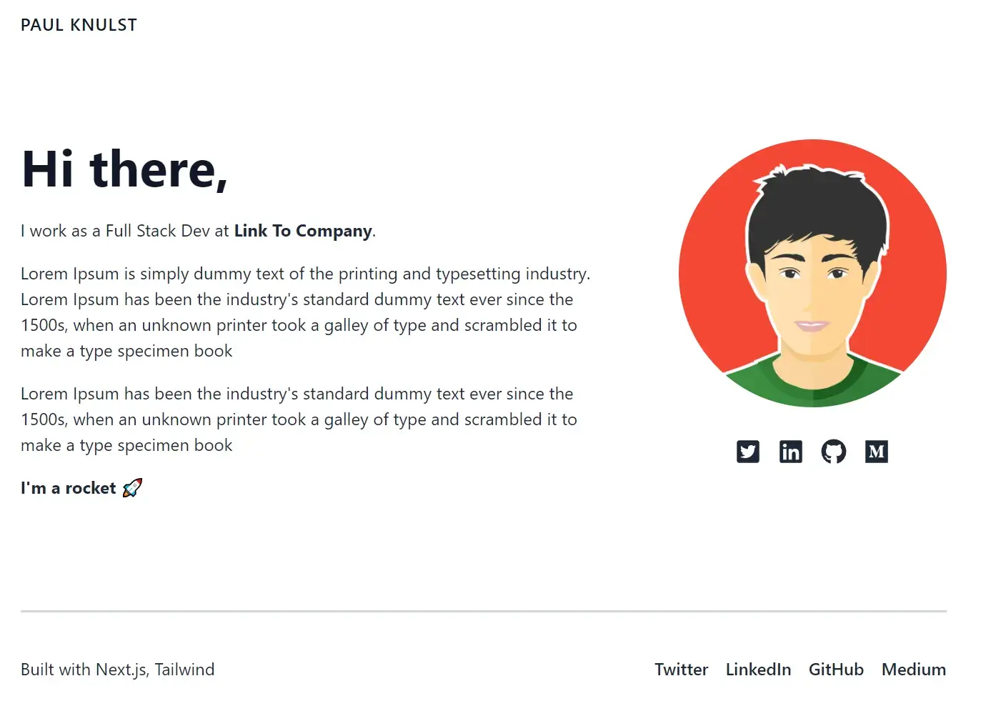
export default HomeIf you have followed every step until now, your web page should look like this:
Add a Dark Mode Switcher
Now you will add a Dark Mode switcher to change between the two themes. To enable a Dark Mode switcher, you will create a ThemeSwitch component that will be used to toggle between Dark and Light Modes.
First, you have to add next-themes package to your package.json by installing it with:
npm install next-themes --saveAfterward, create a new file ThemeSwitch.tsx within the components folder and fill it with the code below:
import {useEffect, useState} from 'react'
import {useTheme} from 'next-themes'

const ThemeSwitch = () => {
    const [mounted, setMounted] = useState(false)
    const {theme, setTheme, resolvedTheme} = useTheme()

    // When mounted on client, now we can show the UI
    useEffect(() => setMounted(true), [])

    return (
        <button
            aria-label="Toggle Dark Mode"
            type="button"
            className="w-8 h-8 p-1 ml-1 mr-1 rounded sm:ml-4"
            onClick={() => setTheme(theme === 'dark' || resolvedTheme === 'dark' ? 'light' : 'dark')}
        >
            <svg
                xmlns="http://www.w3.org/2000/svg"
                viewBox="0 0 20 20"
                fill="currentColor"
                className="text-gray-900 dark:hover:text-sky-500 dark:text-gray-100"
            >
                {mounted && (theme === 'dark' || resolvedTheme === 'dark') ? (
                    <path
                        fillRule="evenodd"
                        d="M10 2a1 1 0 011 1v1a1 1 0 11-2 0V3a1 1 0 011-1zm4 8a4 4 0 11-8 0 4 4 0 018 0zm-.464 4.95l.707.707a1 1 0 001.414-1.414l-.707-.707a1 1 0 00-1.414 1.414zm2.12-10.607a1 1 0 010 1.414l-.706.707a1 1 0 11-1.414-1.414l.707-.707a1 1 0 011.414 0zM17 11a1 1 0 100-2h-1a1 1 0 100 2h1zm-7 4a1 1 0 011 1v1a1 1 0 11-2 0v-1a1 1 0 011-1zM5.05 6.464A1 1 0 106.465 5.05l-.708-.707a1 1 0 00-1.414 1.414l.707.707zm1.414 8.486l-.707.707a1 1 0 01-1.414-1.414l.707-.707a1 1 0 011.414 1.414zM4 11a1 1 0 100-2H3a1 1 0 000 2h1z"
                        clipRule="evenodd"
                    />
                ) : (
                    <path d="M17.293 13.293A8 8 0 016.707 2.707a8.001 8.001 0 1010.586 10.586z"/>
                )}
            </svg>
        </button>
    )
}

export default ThemeSwitch
To use the ThemeSwitch component on your website, you have to add it to your Navigation component, which will look like the file below.
import Link from "next/link"
import React from "react"
import ThemeSwitch from "@components/ThemeSwitch";

const Navigation = () => {
    return (
        <div className="sticky top-0 z-20 py-2 md:py-6 md:mb-6 dark:bg-black bg-white">
            <div className="container px-4 mx-auto lg:max-w-4xl flex items-center justify-between">
                <div className="items-start flex">
                    <Link href="/">
                        <a className={"font-medium tracking-wider transition-colors text-gray-900 dark:hover:text-sky-500 hover:text-sky-500 uppercase dark:text-white"}>
                            Paul Knulst
                        </a>
                    </Link>
                </div>
                <ThemeSwitch/>
            </div>
        </div>
    )
}

export default Navigation;
Additionally, you have to enable the ThemeSwitch within your _app.tsx.This is done by importing the ThemeProvider from next-themes and adding it to the _app.tsx:
import '../styles/globals.css'
import type {AppProps} from 'next/app'
import Navigation from "@components/Navigation";
import Footer from "@components/Footer";
import {ThemeProvider} from "next-themes";

function MyApp({Component, pageProps}: AppProps) {
    return (<div>
            <ThemeProvider attribute="class" enableSystem={false}>
                <Navigation/>
                <Component {...pageProps} />
                <Footer/>
            </ThemeProvider>
        </div>
    )
}

export default MyApp
There are two essential attributes within the ThemeProvider that are used to activate the Dark Mode by default (attribute=class) and disable the system preference (enableSystem=false).
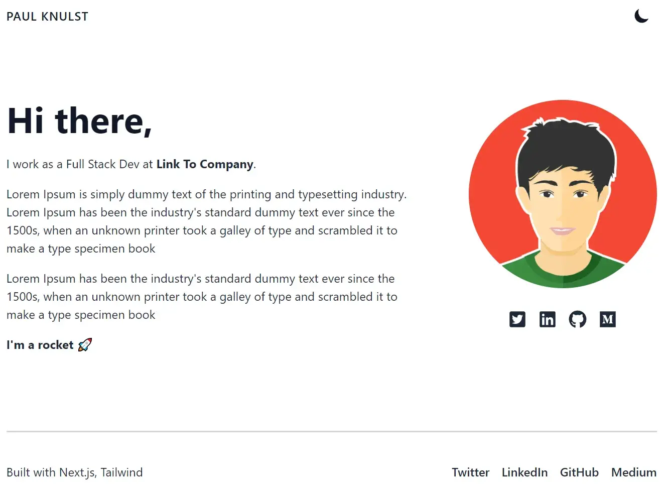
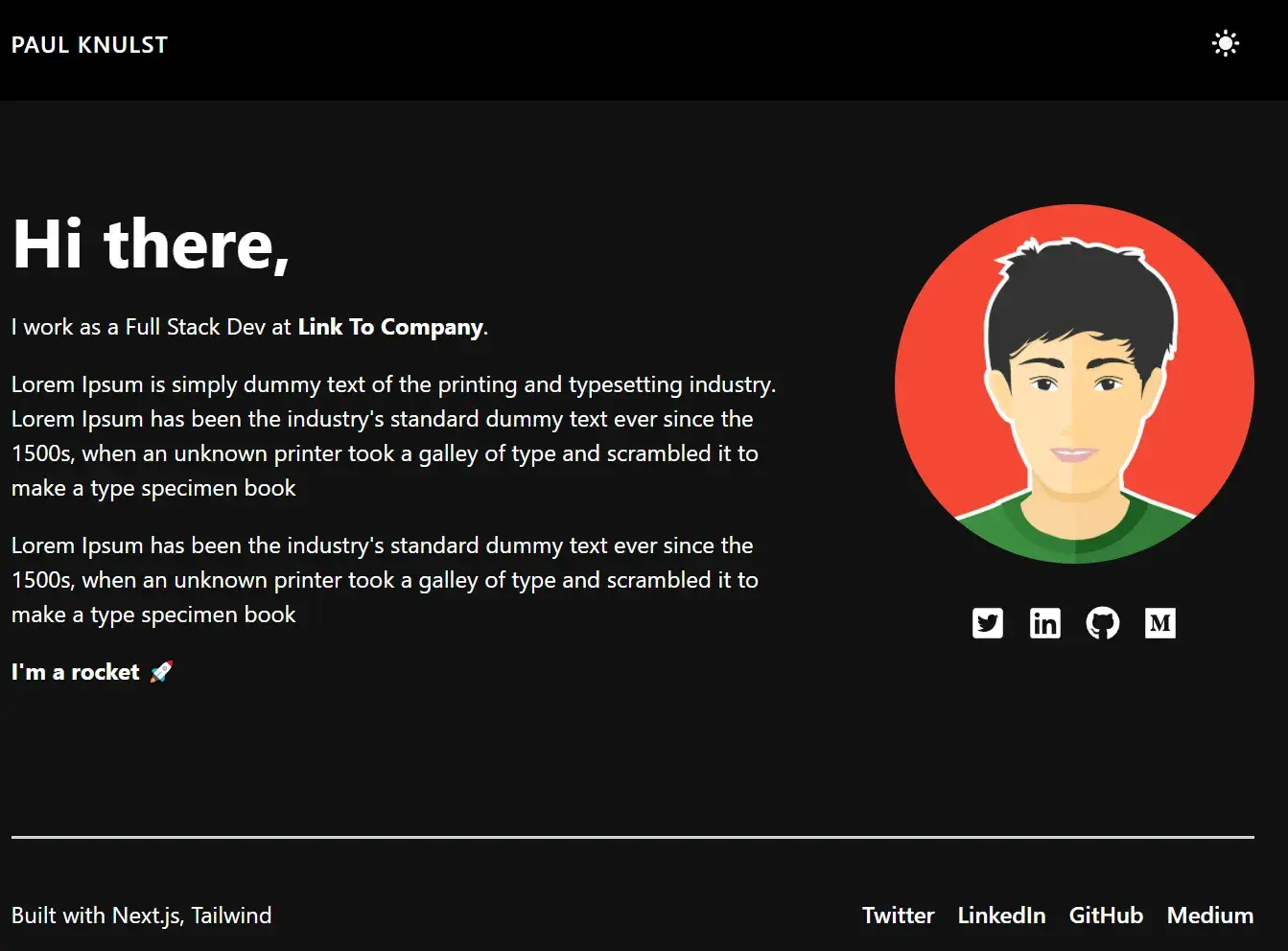
Now you can use the Dark mode, and your portfolio will look like the following:
Adding Meta Tags For SEO
To optimize SEO and add different Meta Tags for every page, a new component MetaContainer will be created that will be the parent of all components and will provide a way to add custom meta tags to every page. Also, it contains the Navigation and the Footer.
Create a MetaContainer.tsx in the components folder and add the following code:
import React from "react";
import Head from "next/head";
import {useRouter} from "next/router";
import Navbar from "@components/Navigation";
import Footer from "@components/Footer";

export default function MetaContainer({children, ...customMeta}) {
    const router = useRouter();

    const meta = {
        title: "Paul Knulst - Tech Lead, Developer, Writer",
        description: `I've been working in IT for ~12 years straight. Get in touch with me to know more.`,
        image: "/public/avatar.png",
        type: "website",
        date: new Date().toDateString(),
        ...customMeta,
    };
    return (
        <div>
            <Head>
                <title>{meta.title}</title>
                <meta name="robots" content="follow, index"/>
                <meta content={meta.description} name="description"/>
                <meta
                    property="og:url"
                    content={`https://www.paulknulst.de${router.asPath}`}
                />
                <link
                    rel="canonical"
                    href={`https://www.paulknulst.de${router.asPath}`}
                />
                <meta property="og:type" content={meta.type}/>
                <meta property="og:site_name" content="Paul Knulst"/>
                <meta property="og:description" content={meta.description}/>
                <meta property="og:title" content={meta.title}/>
                <meta property="og:image" content={meta.image}/>
                <meta name="twitter:card" content="summary_large_image"/>
                <meta name="twitter:site" content="@paulknulst"/>
                <meta name="twitter:title" content={meta.title}/>
                <meta name="twitter:description" content={meta.description}/>
                <meta name="twitter:image" content={meta.image}/>
                {meta.date && (
                    <meta property="article:published_time" content={meta.date}/>
                )}
            </Head>
            <main className="w-full">
                <Navbar/>
                <div>{children}</div>
                <Footer/>
            </main>
        </div>
    );
}
Several Meta Tags are created in this file, a title is set, and Google robot information is added.
After creating the MetaContainer component, you can add it to the _app.tsx, remove the Navigation and the Footer, and wrap your page within the MetaContainer block:
import '../styles/globals.css'
import type {AppProps} from 'next/app'
import {ThemeProvider} from "next-themes";
import MetaContainer from "@components/MetaContainer";

function MyApp({Component, pageProps}: AppProps) {
    return (
        <div>
            <ThemeProvider attribute="class" enableSystem={true}>
                <MetaContainer>
                    <Component {...pageProps} />
                </MetaContainer>
            </ThemeProvider>
        </div>
    )
}

export default MyApp;
Adding A Donation Page
The donation page will contain two different types of how to receive a donation: Stripe and PayPal.
For Stripe, you have to create an account here, add a new account and get the API keys that you find under the "Developers" tab.
For PayPal, you need a PayPal account. Then you can create a new app here and extract the Client Id
Before you can use Stripe and PayPal, you have to install the required packages in your project:
npm i axios --save
npm i @stripe/stripe-js stripe --save
npm i @paypal/react-paypal-js --save
Afterward, you can have to create a new environment file because you will not want to have your API keys within the source code. Create a new .env.local file and add your Stripe and PayPal API keys to it:
STRIPE_SECRET_KEY=<your stripe secret key>
NEXT_PUBLIC_STRIPE_PUBLIC_KEY=<your stripe public key>
NEXT_PUBLIC_PAYPAL_CLIENT_ID=<your paypal client id>
Now create a new component called Sponsor.tsx and add the below code:
import {useState} from "react";
import {useRouter} from "next/router";
import {loadStripe} from "@stripe/stripe-js";
import axios from "axios";
import {PayPalButtons, PayPalScriptProvider} from "@paypal/react-paypal-js";


const Sponsor = () => {
    const [amount, setAmount] = useState<number | 0>(5);
    const {push} = useRouter();

    const paypalOptions = {
        "client-id": process.env.NEXT_PUBLIC_PAYPAL_CLIENT_ID,
        "currency": "USD",
        "intent": "capture",
    }

    const defaultAmounts = [1, 5, 10, 20];
    const createCheckOutSession = async () => {
        const stripePromise = loadStripe(process.env.NEXT_PUBLIC_STRIPE_PUBLIC_KEY);
        const stripe = await stripePromise;
        const checkoutSession = await axios.post("/api/prepare-stripe-payment", {
            amount: amount,
        });

        const result = await stripe?.redirectToCheckout({
            sessionId: checkoutSession.data.id,
        });

        if (result?.error) {
            alert(result?.error.message);
        }
    };
    const paypalBtnStyle = {
        color: 'gold',
        layout: 'horizontal',
        tagline: 'false',
    }

    return (
        <div className="container px-4 mx-auto">
            <div
                className="lg:space-x-5 lg:flex lg:flex-row item-center lg:-mx-4 flex flex-col text-left lg:text-left">
                <div className="pb-16">
                    <h1 className="text-2xl font-bold text-gray-900 lg:text-5xl dark:text-white">
                        Love my work?
                    </h1>
                    <p className="mt-6 text-gray-800 dark:text-white">
                        Feel free to support me with a donation!
                    </p>
                    <p className="mt-6 text-gray-800 dark:text-white">
                        Thanks in advance. Each donation of yours means a lot, however little it might be!
                    </p>
                </div>
                <div
                    className="lg:space-x-5 lg:flex lg:flex-row item-center lg:-mx-4 flex flex-col-reverse text-center lg:text-left">
                    <div
                        className="w-96 flex-col items-center z-10 space-y-5 rounded-md bg-gray-500 dark:bg-slate-900 p-10">
                        <div
                            className="group flex w-full items-center rounded-lg bg-gray-100/30 text-white focus:outline-none">
                            <p className="rounded-l-lg bg-gray-400 px-4 py-3 text-lg text-black">
                                USD
                            </p>
                            <input
                                type="number"
                                className="w-full rounded-lg bg-transparent px-4 py-3 text-gray-300  transition duration-200 focus:outline-none group-hover:opacity-100"
                                placeholder="Enter Amount"
                                value={amount ? amount : ""}
                                onChange={(e) => setAmount(parseInt(e.target.value))}
                            />
                        </div>
                        <div className="flex items-center space-x-2 dark:text-black">
                            {defaultAmounts.map((buttonAmount) => (
                                <button
                                    className={`${
                                        amount === buttonAmount ? "bg-cyan-500 border-cyan-500" : "bg-gray-300"
                                            + " border-4 border-gray-300 hover:border-4 hover:border-cyan-500"
                                    } border-4 border-gray-300 rounded-full px-5 py-2 transition duration-200`}
                                    onClick={() => setAmount(buttonAmount)}
                                    key={buttonAmount}
                                >
                                    {buttonAmount}$
                                </button>
                            ))}
                        </div>
                        <button
                            onClick={createCheckOutSession}
                            className="w-full rounded-lg border-cyan-500 border-2 hover:border-2 bg-cyan-500 py-3 text-xl font-bold hover:bg-cyan-600 hover:border-cyan-600">
                            <span className="dark:text-black">Stripe</span>
                        </button>
                        <div className="w-full rounded-lg text-xl font-bold">
                            <PayPalScriptProvider options={paypalOptions}>
                                <PayPalButtons
                                    style={paypalBtnStyle}
                                    createOrder={(data, actions) => {
                                        return actions.order.create({
                                            purchase_units: [
                                                {
                                                    amount: {
                                                        value: "" + amount,
                                                    },
                                                },
                                            ],
                                        });
                                    }}
                                    onApprove={(data, actions) => {
                                        return actions.order.capture().then((details) => {
                                            push("/payment-successful").then()
                                        });
                                    }}
                                />
                            </PayPalScriptProvider>
                        </div>
                    </div>
                </div>
            </div>
        </div>
    )
}

export default Sponsor;
To see the Donation page within your portfolio, you have to add a new page within the pages folder called supportme.tsx and add the following code:
import Sponsor from "@components/Sponsor";
import {NextPage} from "next";

const SupportMe: NextPage = () => {
    return (
        <div className="space-y-14 lg:space-y-24">
            <main className="max-w-4xl mx-auto mt-16 antialiased">
                <Sponsor/>
            </main>
        </div>
    )
}

export default SupportMe
Furthermore, you should edit the Navigation and add the Donation page. This is done by editing the Navigation.tsx component so that it looks like the code below:
import Link from "next/link"
import React from "react"
import ThemeSwitch from "@components/ThemeSwitch";

const Navigation = () => {
    return (
        <div className="sticky top-0 z-20 py-2 md:py-6 md:mb-6 dark:bg-black bg-white">
            <div className="container px-4 mx-auto lg:max-w-4xl flex items-center justify-between">
                <div className="items-start flex">
                    <Link href="/">
                        <a className={"font-medium tracking-wider transition-colors text-gray-900 dark:hover:text-sky-500 hover:text-sky-500 uppercase dark:text-white"}>
                            Paul Knulst
                        </a>
                    </Link>
                </div>
                <div className="items-end flex space-x-5">
                    <Link href="/supportme">
                        <a className="font-medium tracking-wider transition-colors text-gray-900 dark:hover:text-sky-500 hover:text-sky-500 uppercase dark:text-white">
                            Support Me
                        </a>
                    </Link>
                    <ThemeSwitch/>
                </div>
            </div>
        </div>
    )
}

export default Navigation;
By now, the PayPal integration is theoretically working, and you can receive payments. To enable Stripe payments you need an API endpoint in your portfolio project. Create a new file prepare-stripe-payment.ts within /pages/api/ and add the following code:
const stripe = require("stripe")(process.env.STRIPE_SECRET_KEY);
import {NextApiRequest, NextApiResponse} from "next";

const URL = process.env.BASE_URL;

const handler = async (req: NextApiRequest, res: NextApiResponse) => {
    const {amount} = req.body;

    const items = [{
        price_data: {
            currency: "usd",
            product_data: {
                name: `Sponsor Paul`,
            },
            unit_amount: amount * 100,
        },
        quantity: 1,
    },];

    const session = await stripe.checkout.sessions.create({
        line_items: items,
        mode: "payment",
        success_url: `${URL}/payment-successful`,
        cancel_url: URL,
    });

    res.status(200).json({id: session.id});
};

export default handler;
Additionally, you have to add your base URL to the .env.local (name the env BASE_URL). For testing purposes, you can change the prepare-stripe-payment.ts file and change the URL:
const URL =
  process.env.NODE_ENV === "development"
    ? "http://localhost:3000"
    : process.env.BASE_URL;
The last step is to add a success page that will be called after a donation is received. This file is called payment-successful.tsx and should be created in /pages/ folder.
As an example for a success page, you can use my example code:
const PaymentSuccessful = () => {
return (
<main className="flex-auto flex-1 flex-col items-center justify-center">
<div className="flex flex-wrap h-auto w-auto items-center justify-evenly p-10">
<div className="flex-none h-auto w-auto items-center justify-center pt-36">
<h1 className="text-3xl font-bold">
Thank you for sponsoring me 💙
</h1>
</div>
</div>
</main>
);
};
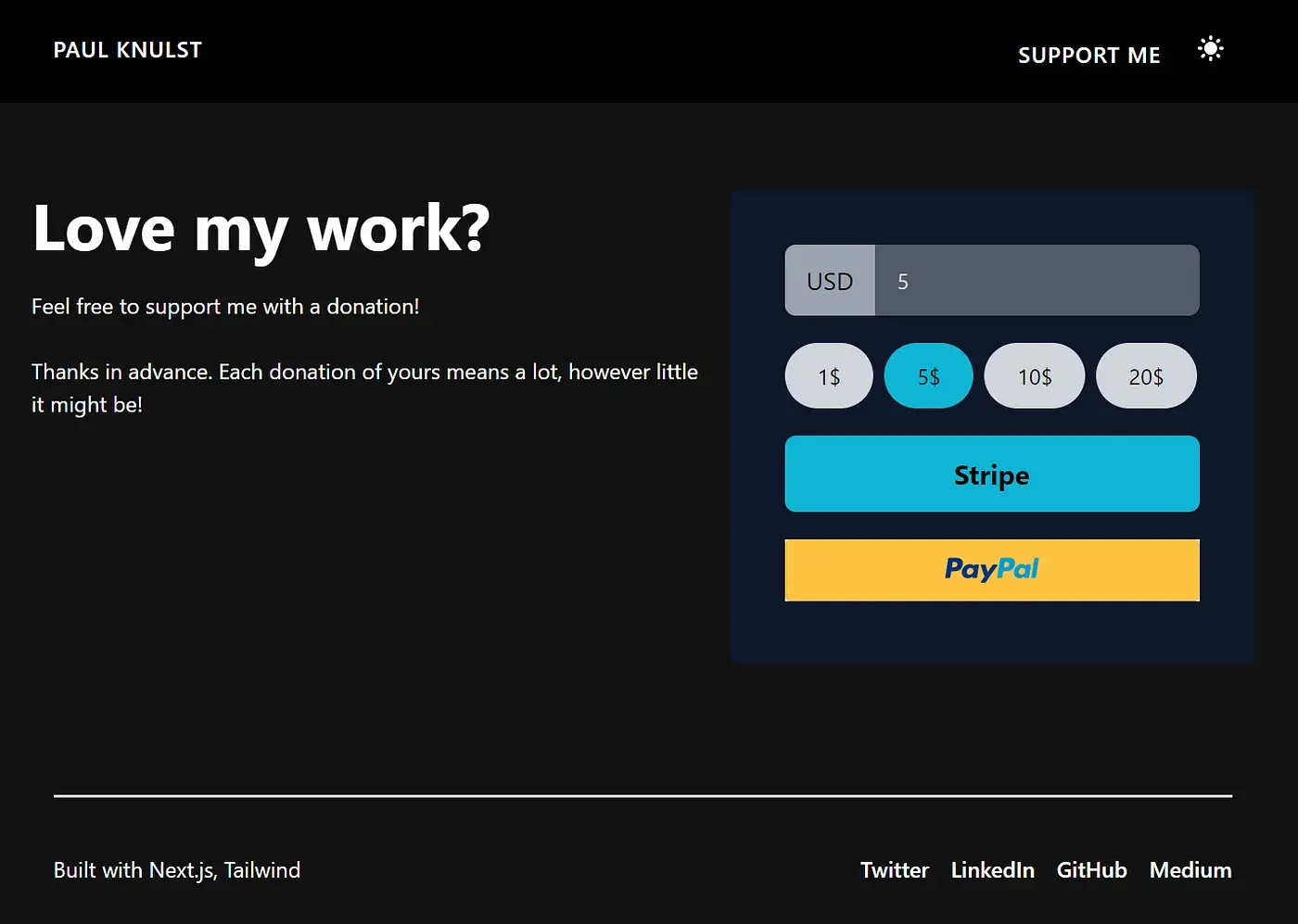
export default PaymentSuccessful;Now, you can switch to your portfolio, and your donation page will look like this:
Deploy Your App To Vercel
On Vercel, you can deploy your portfolio with a sponsor page in some steps:
- Deploy your portfolio to GitHub
- Create a Vercel account
- Connect your GitHub repository
- Deploy your repository
- Wait until the project is deployed
- Go to environment variables inside of settings and add every variable
- Redeploy your app
Now your portfolio is ready and can be shared everywhere.
Closing Notes
I hope, you could easily follow the guide and this tutorial can help you to create your portfolio website with sponsor functionality, as I have done at www.paulknulst.de. Unfortunately, this portfolio is very simple and I did not optimize it.
You can go to my GitHub repository and download a copy of a dummy portfolio (within folder v0 or my deployed portfolio v2 with additional features) that contains plain docker-compose files. These files can be used to deploy the portfolio with Docker on a single server or in a server cluster running Docker in Docker Swarm mode. If you want to know more about deploying it with Docker, you can read my "Deploy any SSL secured website with Docker" tutorial and my "Docker Swarm in a nutshell" tutorial which explains in detail how to set up and use Docker in production.
If you enjoyed reading this article consider commenting your valuable thoughts in the comments section. I would love to hear your feedback about my tutorial. Furthermore, share this article with fellow software developers to help them create their own portfolios.
Feel free to connect with me on Medium, LinkedIn, Twitter, and GitHub.
Thank you for reading, and happy Coding!
🙌 Support this content
If you like this content, please consider supporting me. You can share it on social media, buy me a coffee, or become a paid member. Any support helps.
See the contribute page for all (free or paid) ways to say thank you!
Thanks! 🥰